Friday, December 5, 2008

Unemployment data today


Pretty ugly...

This and more scary charts of this market and available from http://econompicdata.blogspot.com/

Friday, November 7, 2008

The Threat of Deflation

There has been some coverage in the news of the potential threat of deflation, an area of which we know less:

Here are links to Fed speeches and papers on deflation (from Dave Backus):


On deflation, here is a recent speech:

http://www.federalreserve.gov/BOARDDOCS/SPEECHES/2002/20021121/default.htm

Here are some academic sources:


http://www.minneapolisfed.org/publications_papers/pub_display.cfm?id=3350


http://www.minneapolisfed.org/publications_papers/pub_display.cfm?id=931

The Perils of Picking a Bottom (or Top)


The chart above is of the volatility index (from finance.yahoo.com). It measures the implied volatility of different options traded on the CBOE. It tells you the rough costs of purchasing options (for example, high volatility means a higher likelihood a call or put option will be used and hence more expensive). If you believe volatility (and the VIX) is likely to decline in future, it makes sense to sell options. If you believe it is likely to increase (it makes sense to purchase them). In this sense, the VIX is an indicator of market risk.

Two interesting aspects of this chart of the VIX.

1) It is very hard to tell where the peak is (and thus attempt to get into this market). March and August of 2007 appear to be new highs as do April of 2008 and notice several mini peaks in October of 2008. (You would also be in a period where you would definitely have to consider counter-party risk very carefully if you are purchaser of options.)

Historically a value above 30 indicated market stress. Look at the last two months!

The chart of the S&P 500 (below) is also from finance.yahoo.com. You can see that despite several attempts to call a bottom, no one really knows where the bottom is.


2) You can also observe a potential behaviorial problem for financial market participants from this VIX index. If you earn income from selling options, your income declines on a per option basis (securing risk is cheap and you earn less by agreeing to take it on from others). This should be a market signal to be a net buyer rather than seller of such options and indeed some hedge funds are likely to move in and out of this business accordingly.

However, a bread and butter firm that sells options is likely to have to respond by sell more options to generate the same revenue (which their bosses are probably demanding). So although it might seem in stable periods that things can only get riskier (and your income from accepting such risk by writing an option is at record lows), you may be ironically respond by taking on even more risk.

This is an aspect of the "chasing yield" story. In times when yields are down (indicating little reward taking on for risk), investors often respond by investing in ever riskier assets (be they junk bonds or CDO equity tranches) as these are the only investments at the time that are yielding high returns.

The irony is that while a particularly risky junk bond may be yielding close to 8% and few other assets yield close to that, the true value of that bond when taking into account the risks may be closer to 12% Instead of walking away, if a firm had a target of a 12% return, they would borrow money and lever up on more of these bonds until they were able to reach their targeted return. Of course, they are taking on a tremendous risk and are likely to get burned.

In reality, they should sit out the market or "short" the market. For example, the could just invest in purchasing put options on the underlying asset (a right to sell at a fixed price, hoping these assets become riskier and their value fall so that you can buy at the cheap price and immediately resell at the high price you previously arranged to lock in).

Friday, October 31, 2008

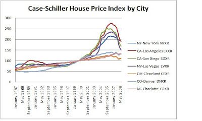
A Tale of Two Housing Markets


It is important to remember that while there has been a great run-up in housing prices in recent years, there have been large parts of the country that saw little of the boom.

Part of the reason for this is because there have always been two housing markets, one in major (usually coastal) cities where supply is constrained (relatively inelastic, like Manhattan). In this case housing demand (ultimately disposable income) drives housing prices.

In other parts of the country, land is freely available for development and increasing prices only lead to increased housing construction (relatively elastic supply). Over the long term, housing prices closely track the cost of increasing supply - the cost of construction (and factors like lumber prices or the wages of Joe the Plumber).

ON the Bubble Overall:

In terms of the bubble overall, easy access to credit due to lower quality lending, a permissive interest rate environment and an influx of foreign buyers during a period of dollar weakness, all combined to push many cities above historic norms. These forces were probably most felt in major coastal cities (though limited increases in supply during this period may limit the eventual fall).

However, these variables can only lead to one-off increases in prices and not continually higher prices (e.g. interest rates can at best eventually fall to zero, exchange rates shift and foreign investors also eventually find prices to high for their incomes). If prices continually rise above income, eventually a point is reached where virtually all of the typical household's income goes to housing and no new buyers are available.

Most curious to note are cases like Miami and Los Vegas that saw large price increases in that they are not supply constrained. Drive north along the coast from Miami or survey the area from Google maps and one sees large tracts of land still available for development, even on the water. Similarly, a shorter commute can support relatively higher prices in the more central neighborhoods of Los Vegas, but are hard to sustain if prices are much lower just a short drive away to cheaper, new construction. In both cities, as prices increased dramatically in recent years, so did construction and many of those units are just now coming onto the markets (supply increasing just as demand drops = collapsing prices).

Predictions for the future - Prof. Roubini predicts extended stock declines (TV interview)

Corporate Profits and Stock Prices


In the long term, stock prices reflect the earnings (profits) of companies. When asking why the stock market is down and when it is likely to recover, this chart is handy to remember. From the latest monthly economic indicator report published by the Joint Economic Committee of Congress (and prepared by the President's Council of Economic Advisers).

http://www.gpoaccess.gov/indicators/index.html

If we assume that stock prices reflect earnings (P/E values matter), prices will follow earnings...

Looking forward, as earnings start to recover, stocks may look quite attractive. See a Wall Street Journal graphic on global P/E rates below. Article is here.

Please note that there are two issues in trying to determine whether stocks are cheap or not. First, what is the P/E ratio below which stocks appear attractive? The chart below uses a long-term average (in green), but this is always open to question. Second, how do you measure earnings (trailing of the last 12 months, forward looking over the next 12 months, or using some moving average combining past, present and future earnings). Forward looking earnings are very inaccurate, earnings and earnings projections at the peak of the business cycle are naturally much higher than they are at the bottom of a cycle. Also do you look at operating earnings or some adjusted form of earnings. So different choices in measuring earnings yield widely different results in the measurements of P/E ratios.


According to S&P, the combined 12 month trailing earnings for the S&P 500 as of Sept 2008 was $52.67. So simply divide the closing value of index on any given day by that earnings value to get a quick P/E estimate. On the close of markets on Oct 27th, the S&P 500 was about 850 and the P/E ratio was about 16. By Halloween (10/31) it was 968 and so the P/E ratio was over 18. But stock markets are about projecting forward and guessing when earnings will rebound and to what level is the real challenge.

Here is link to another good chart looking at P/E ratios historically (from Ned Davis Research).

Here is a matrix showing different prices varying P/E ratios and projected earnings for the S&P 500 (forward looking for 2009) from the
Bespoke Investment Group.